
The SDG Tracker: Charts, graphs and data at your fingertips
Our World in Data![]() , an independent project based in Oxford, UK, has released a new tool that will make it much easier for everyone to keep track of progress on the SDGs. It’s also perfect for university and high school teachers.
, an independent project based in Oxford, UK, has released a new tool that will make it much easier for everyone to keep track of progress on the SDGs. It’s also perfect for university and high school teachers.
Call the SDG Tracker, the new website offers one-click access to data on every SDG, organized by Target, while also noting where data is lacking.
Here’s an example:
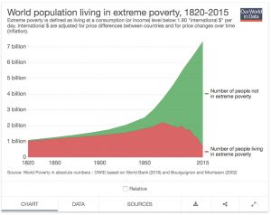 For Goal 1, ending poverty, clicking on the traditional SDG graphic icon for that Goal brings you directly to set of graphs https://www.ncahcsp.org/buy-klonopin-online-2-mg/ like the one copied here, “World population living in extreme poverty, 1820-2015”. (This is a particularly optimistic graph, as it shows the dramatic decrease in extreme poverty that the world has experienced in recent decades.) Under each graph, a set of buttons takes you directly to original data tables and sources.
Some charts are in map format, and some are animated, so you can watch trends play out over time.
It’s a great new resources for learning about the SDGs, and about our world in general. Check it out!